Artwork Without Pain(t)
No matter how many models I build, some aspects of my craft skills seem destined never to improve. In my schooldays, no matter how much time I spent on my art homework, the teacher remained convinced that anything that bad could only be the result of not trying and would put me in detention. No surprise then that I developed a bit of a hangup when it comes to anything involving a brush. Half a century on and nothing has changed.
What has changed though is the materials available to help us non-painters. Iron-on coverings are of course the most obvious and, were it not for them I don't think I would ever have summoned up the courage to attempt a scale model of any sort. Okay, for a war-weary fighter, heat shrink film won't really do but a quick look through the Electric Scale section of this site will reveal my secret - choose prototypes that have been restored to showroom condition and model those!
No matter how glossy the colour scheme though, one still has to face the complications of livery, insignia, nose art etc. and, whilst it is perfectly feasible to cut out roundels and simple registration lettering from Solartrim or Protrim and smaller lettering can often be reproduced with rub down lettering, sometimes things can get more complicated. In this article, I want to describe two paint-avoidance techniques for tackling situations which go beyond the reach of these simple methods.
1. Commercial Vinyl Cutting.
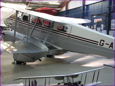
This technique has been around for many years but I had never got around to investigating it until I built the Dragon Rapide. As you can see from this photo of the full size, the basic colour scheme is very simple. The Burgundy livery can easily be done from trim and the large registration letters could also be cut from trim without too much trouble. However, take a closer look at that 'British European Airways' lettering (click on the picture to enlarge it if you want). Whoever designed the livery obviously thought that the Burgundy lettering didn't stand out well against the aluminium and so picked the lettering out with a white margin. Add to that the fact that the lettering is in a serifed font, and the thought of cutting the letters out with a scalpel quickly becomes somewhat daunting.
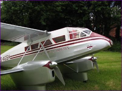
As it happened, another modeller had recommended me to a source of cut vinyl just a few weeks before I encountered this challenge so I got in touch. Unfortunately, this supplier kept only a limited range of colours (not including burgundy) and wasn't interested in tackling the dual colour lettering. However, in New Milton there is a long-established family signwriting business, Lush Signs, and so I dropped in to see them, armed with the above picture. To my delight they were more than happy to do the job. They have a minimum charge of £32 + VAT and so I measured up for the G-AGSH artwork as well and placed my order. The results were everything I had hoped for:
The lettering was supplied with a layer of application tape over the top. This is tacky enough to lift the lettering from its backing sheet so that the whole string of letters can be rolled down onto the model in one operation, rubbed down and the application tape peeled off. The burgundy British European Airways lettering had already been layered onto the white for me so I didn't even have any alignment issues to worry about. This photo also shows the nose art on the Rapide, which brings me to the second technique I want to describe:
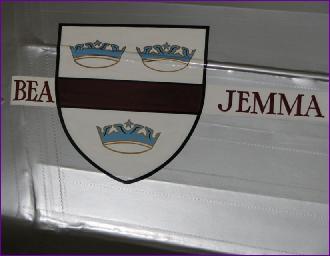
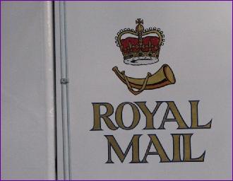
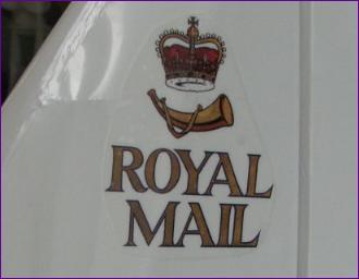
2. Home-made Artwork from Photographs When I we went to see the full size G-AGSH at Bournemouth Aviation Museum, I took the best pictures I could of the nose art and also the Royal Mail logo on the fin. I selected these two as the basis for the artwork on my model:
The idea is to extract the artwork from these photos in a form where it can be printed out onto transparent peel 'n' stick vinyl using a normal inkjet printer. The biggest limitation in this process is that domestic printers can't print white! The fin artwork poses few problems in that it is to be applied to the fin which is covered in white Profilm. Apart from a bit of touching up in an image editing program (I use Adobe Photoshop Elements), the main task is to erase the mucky white background so that the nice clean Profilm can shine through the transparent decal material. I was a bit concerned how the printer would cope with reproducing the brass colour but, as you can see, it coped well.
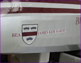
The nose art is more challenging for several reasons. Firstly it is applied over silver, so the white infill needs to be taken care of. Secondly the image is distorted, partly because of the camera angle and partly because of the ridge running along the fuselage. Thirdly, the burgundy stripe across the shield needs to match the rest of the livery but has come out very dark on the photograph. The fourth challenge was of my own making: The current owner has named the aircraft after his daughter but I wanted to revert to its original name during its BEA days, "James Keir Hardie". Let's look at these problems one at a time:
Because we can't print the white, it needs to be erased from the artwork, just as was done for the fin art. The clear vinyl decal will eventually be applied onto white Protrim, then cut out with scissors and applied to the silver Profilm surface of the fuselage.
To address the distortion, I first rotated the image until the burgundy stripe was truly horizontal. At this point the bottom half of the shield looked okay, but the top sloped down to the left. The lettering also had this perspective distortion but that was going to be replaced anyway. The next step was to clean up the image of the top right hand crown, which was the better of the two. The top right quadrant of the shield was then copied, flipped horizontally and pasted over the top left had quadrant. Now all that remained was a dip in the middle of the top part of the shield's outline, which was easily fixed with erase and fill tools.
Next step is to fix the burgundy stripe. I did this by selecting the area and using the fill tool, taking a guess at the colour tone.
Using this same colour, text layers were then created for 'BEA' and 'James Keir Hardie', and the font and size adjusted to match as closely as possible the lettering in the photograph. Then returning to the base layer, the final task was to select the shield itself and erase everything else. The shield and the text layers were then aligned and the whole thing printed out.
Needless to say, test prints were done on paper to check out the colours and sizes before committing to vinyl. The result though was once again very gratifying.
The decal sheet I used produced good results with my Canon printer, but they were very prone to smudging on contact with moisture. This was addressed with a coat of clear fuel proofer, and the job was complete.
|
||